What is SwiftUI?
SwiftUI is a general-purpose, multi-paradigm, compiled programming language developed and managed by Apple to build and design applications for both iOS, macOS, and tvOs.
It is a revolutionary way to build interactive UIs across all Apple platforms, and with the use of SwiftUI, you can define how your app’s UI should perform with declarative language so you can get rid of confusing UIKit code. SwiftUI provides auto support for Dynamic Type, Dark Mode, localization, and accessibility.
SwiftUI to Build Declarative User Interfaces
Why Declarative UIs are Important?
Declarative UI is one type of UI Designing that allows us to design a view in a declarative manner means we can describe what we want to show on our UI View & what kind of actions we want to trigger on user interaction.
We can define states of apps at once using declarative UI. In case if there is any text entered by the user, then we need to show that clear button & when the user has removed text from the text field, then that clear button should hide. So, using declarative UI, we can tell Swift UI to handle such states based on the user’s interaction. We don’t need to handle these states by hardcode like the old imperative way using some If/Else conditions.
What Was the Old Way to Design UI?
Before SwiftUI, there was UIKit; It is also a user interface framework that has many UI elements like UIButton, UILabel, UIimageVIew etc. that we can use it to design a view by drag & drop.
If we are using UIKit, then we need to use XIBs or storyboards to design the interface. In that, we need to drag & drop UI elements inside it & need to give outlets to its particular class. We can also design interface programmatically by creating UI elements’ Objects in their specific category. Suppose, If you want to give a corner radius to the button, then you need to write code for that. It is like giving the command to do so.
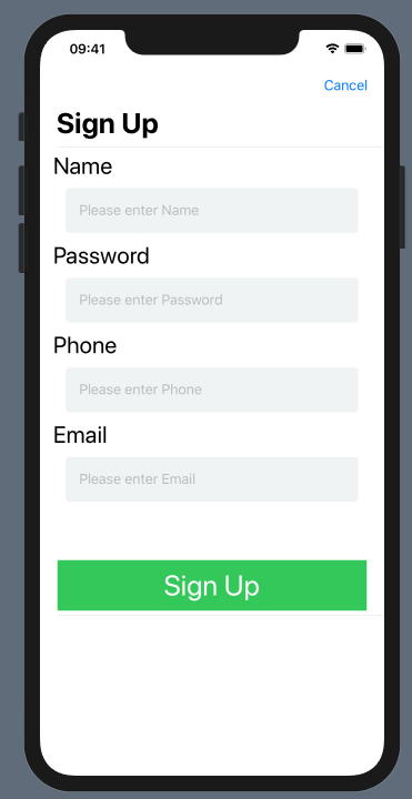
Suppose If I have to design a signup form with UIKit, then below are some things that you will be required to take care of:
- Add UIScrollView or Vertical UIStackView to the view.
- Add multiple Text Fields, UIlables, UIImageView, UIButton, etc.
- Give constraints to all the elements on the View.
- Give Outlets to these elements.
If you want to do some modifications to these elements like giving background or text color, then that will require some code or actions.
Watch out the WWDC19 video introducing SwiftUI with great examples and differences between UIKit and SwiftUI:
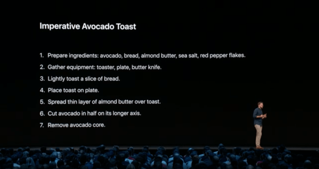
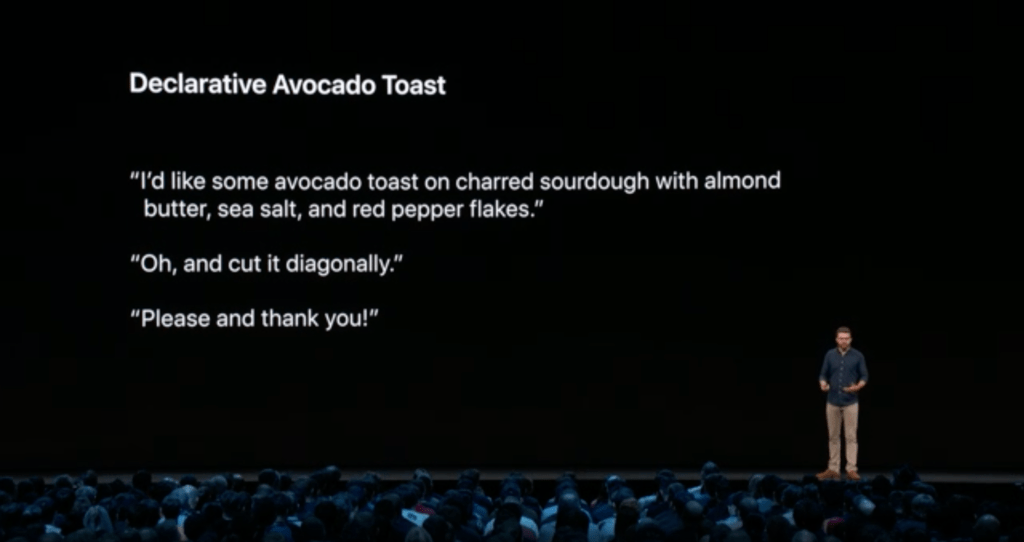
In contrast to this, using SwiftUI, you just need to declare all this interface to swift code, No need to use XIB or Storyboard & it will make sure that this will execute in the way you want.
Here’s what that looks like:
- Hey SwiftUI, I want to group 3 or 4 Text Fields and a button & image view in a vertical stack on the screen.
SwiftUI will build interface as we want & Put all the elements in List & in a vertical stack.
 ” width=”1024″ height=”542″ class=”alignnone size-full wp-image-11330″ />
What are the Benefits of SwiftUI?
SwiftUI provides different types of controls, layout structured, view to build the user interface. It is also providing various kinds of gestures, user input controls & provides an excellent mechanism to execute the flow of the app.
You can use SwiftUI elements with UIKit, AppKit & WatchKit to modify the platform-specific features.
SwiftUI has given solutions to the many problems that we are facing with UIKit or swift:
- If we change in the UI, it will not recompile code again & again. It will increase development speed.
- Any Source control related issues like while committing user interface code, we are facing version control issue in XML Files, It will not happen with SwiftUI.
SwiftUI: Getting Started
SwiftUI gives us an excellent mechanism to design forms or setting screen; It is a unique way to develop an app which has types UI in which we need to take user inputs.
Let me explain with a demo form sign up using SwiftUI:

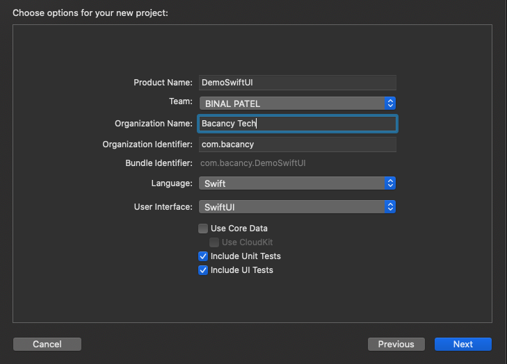
First of all, We need to create a new project with the following details:
At first, The design canvas will look something like this; you can see the live preview of code on the right side in the simulator:
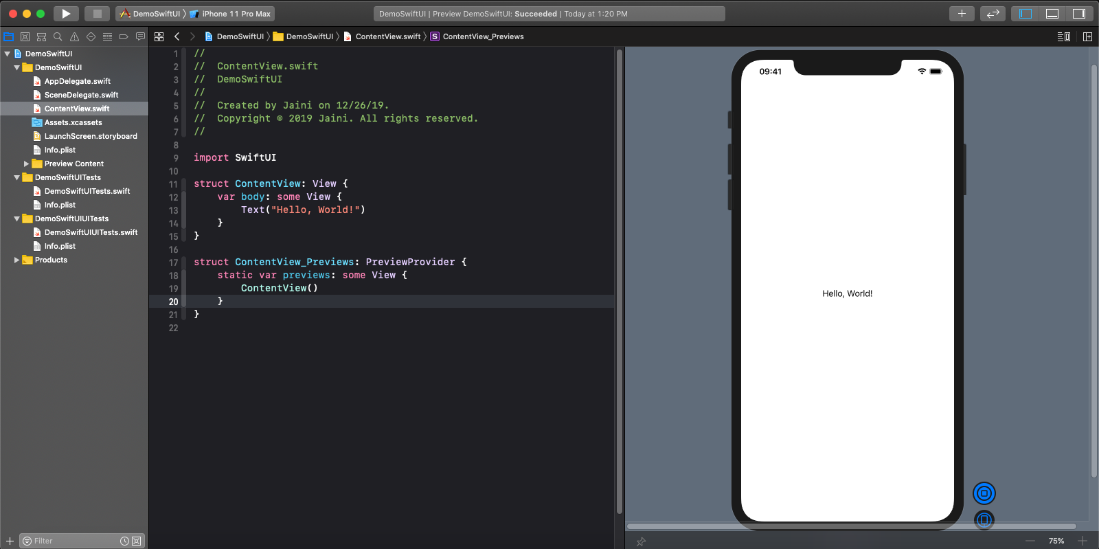
You can Play/Pause live preview using the button, that is beside the simulator on the right side:
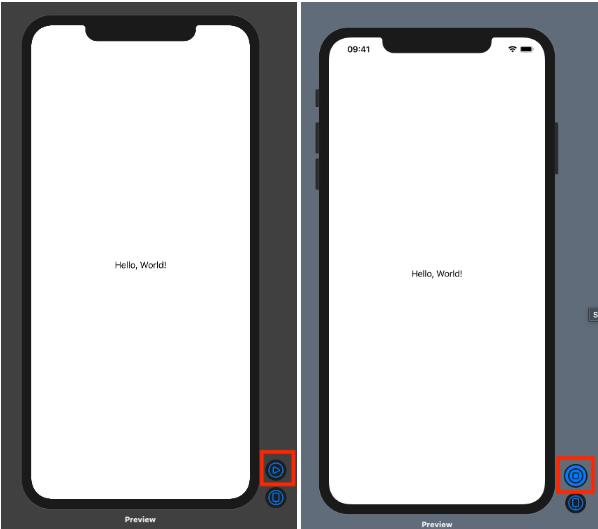
Design Some Basic elements:
We will begin the design part with some basic UI controls like label & text fields. If we want to create a label, then I can use “Text” Component & write code like this:

Inside Text bracket, I can write the text of label & using “font” I can define fonts of Label.
If we want to create a TextField, then I can use “TextField” Component & write code like this:

To Place the label above the text field, we need to use “VStack” to put them in a vertical manner:
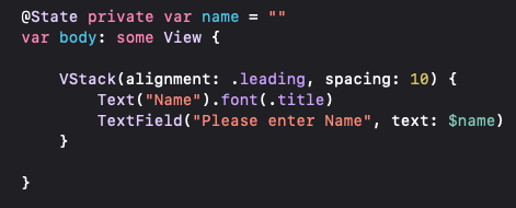
So, the final output will be as follows:
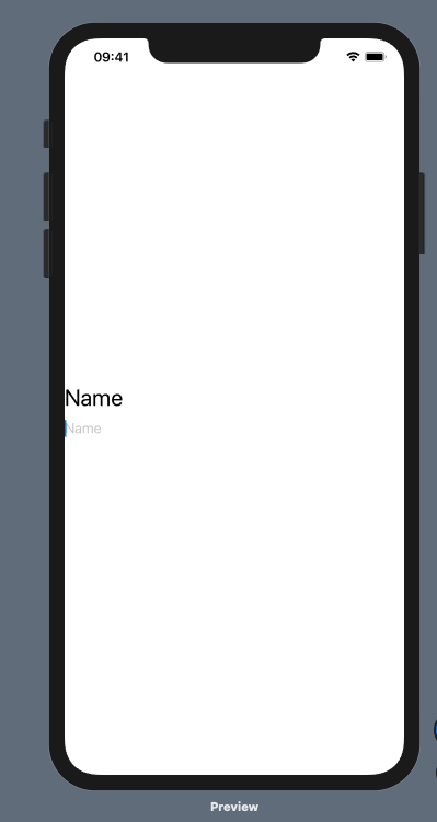
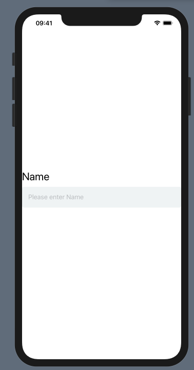
As you can see, there is no padding on the left or right side of the TextField, So we need to make some modifications for it using padding property.
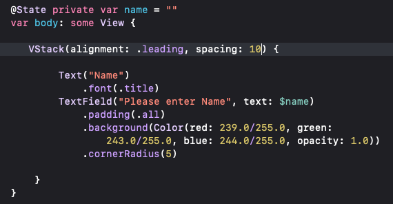
Now, the output will be as follows:
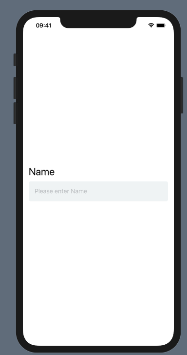
To add the padding around label & textfield both, you will be required to add padding for VStack:
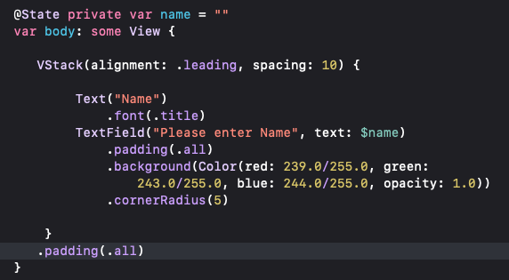
Now, the output will be as follows:
As you can see, all text field shares the same layout, so instead of rewriting code again & again, you can create a separate view to reuse it.
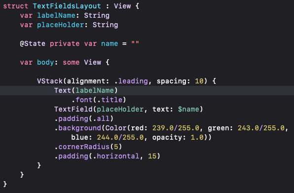
Here, I am creating a struct named TextFieldsLayout & move VStack code inside it.
For reuse purpose, we need to add two variables: label name & placeHolder so that the final code will be:
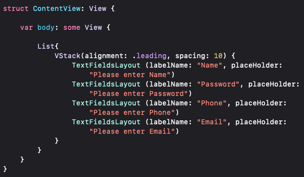
Now, I am going to add this TextFieldsLayout in ContentView with a specified label name & placeholder.
As we can’t show all the information in a single view, We need to embed this VStack in the List component. So, It will become a scrollable view.
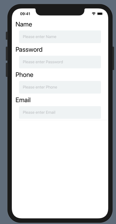
So, The final output will be as follows:
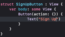
Now, I want to create a Sign-Up button. We can create it by using the button component. The code inside the action parameter will trigger when the user clicks on it.

To better organize the code, we will create a struct named SignUpButton.
Now, I am going to do some modification for a button-like setting its font & changing its background color.
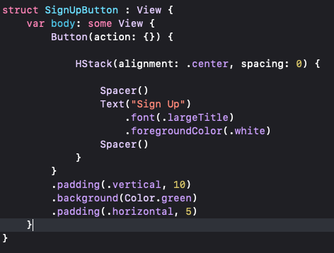
Let me add SignUpButton struct inside the VStack after the last Textfield in the ContentView.
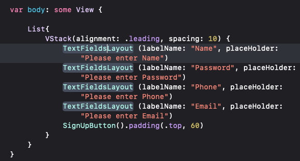
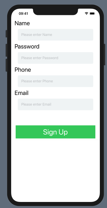
So, The final output will be as follows:
Here we will be required to add a title to the top of the screen, So now we will embed this ContentView’s code inside the NavigationView component.
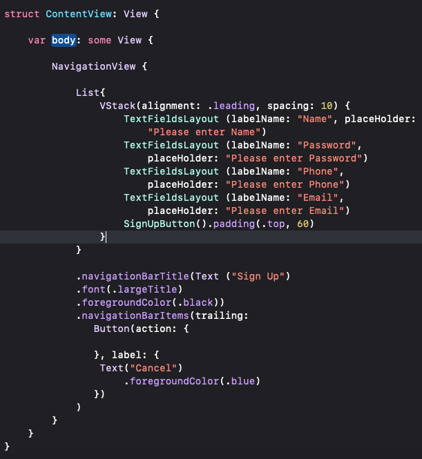
Here, I have added navigationBarTitle to add the Title of the screen & navigation bar items to add bar items. Here, I have added the Cancel button as a bar item on the top right corner of the screen using a trailing parameter.
So, the final Preview of the app will be as follows:
