Your end-users always expect the UI to be more consistent, comfortable, and attractive in web and mobile applications. With that consideration, the product should be developed, keeping the user interface’s consistency in their minds. This task can be challenging when there’s a need for a responsive website for different screen widths and layouts. So, I have come up with this blog that will help you build a Responsive React Filter Component. Without much ado, let’s start coding.
Table of Index
1. User Interface for Responsive React Filter Component
2. Steps for building React Filter Component:
- Building a Button controlling React Filter Component
- Design of the Button using CSS
- Use of Ref and useEffect
- Implementing Modal for Mobile Devices using Reach UI
- Putting all the pieces together
User Interface for Responsive React Filter Component
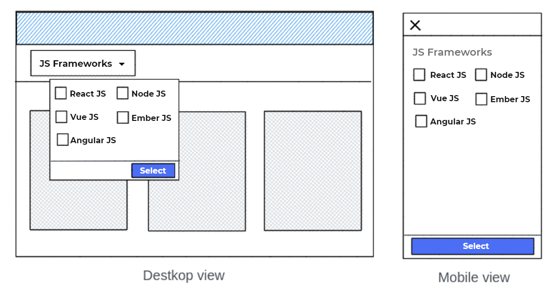
Before discussing how to build a responsive React Filter Component, let’s see the UI and its use case. So, here is the mockup of the component that we are going to build. The main idea of it is – on clicking the button named JS Frameworks, a dropdown will be displayed for web applications, and for mobile applications, it will cover the entire screen. I hope you have understood the UI, structure, and need.
Steps for building React Filter Component
As we discussed earlier, we wanted to build a component that satisfies various screen widths. Thus, I would create one common component for this filter, which would decide which component should be displayed depending on different screen widths. But, before that, we need to do a lot more code. For simplifying it, I have divided it into five parts, maintaining the flow to code at ease.
Looking for assistance that built React Filter Component in your app?
You click away. Connect with the best ReactJS Development company for building React Filter Components with visually appealing apps.
Building a Button controlling React Filter Component
In the first step, I will implement a Button having the state value for opening and closing the filter. I have also given a basic styling to the button to make it look good; you can change the design at your convenience.
// FilterComponent.js
import React, { useState } from 'react';
import './FilterComponent.css';
function FilterComponent() {
// Declaring a new state variable named "isOpen"
const [isOpen, setIsOpen] = useState(false);
return (
< div className="filter_wrapper" >
< button
onClick={() => setIsOpen(!isOpen)}
className="filter_button"
>
JS Frameworks
< /button >
< /div >
);
}
Design of the Button using CSS
// FilterComponent.css
.filter_wrapper {
 position: relative;
 display: inline-block;
}
.filter_button {
 border-radius: 5px;
 padding: 8px 16px;
 background-color: #408aeb;
 cursor: pointer;
 font-weight: 500;
 color: white;
 font-size: 18px;
 line-height: 1.5;
}
.filter_button:hover {
 background-color: #092b58;
}
.filter_button:focus {
 outline: 1px dashed;
 outline: 1px auto -webkit-focus-ring-color;
}
Use of Ref and useEffect
So far, we have made our React Filter component and styled it with a basic design. One more thing to be done is whenever users click outside an opened dropdown; they would expect the dropdown to be closed. For that, I will use the Ref and useEffect.
useEffect(() => {
   const handleClick = event => {
     const isDropdownClicked =
       dropdownRef.current && dropdownRef.current.contains(event.target);
     const isButtonClicked =
       buttonRef.current && buttonRef.current.contains(event.target);


if (isDropdownClicked || isButtonClicked) {
       // We would do nothing if the ref is undefined or the user clicks on the menu.
       return;
     }
     // Or else close the menu.
     setIsOpen(false);
   };

     document.addEventListener("mousedown", handleClick);
     document.addEventListener("touchstart", handleClick);

   // cleanup
   return () => {
     document.removeEventListener("mousedown", handleClick);
     document.removeEventListener("touchstart", handleClick);
   };
 }, [dropdownRef, buttonRef]);
Tip – You can use a custom user hook, useClickOutside, and write your logic of useEffect there to avoid cluttering in your component.
Let’s have a glance at our component. So far, so good!
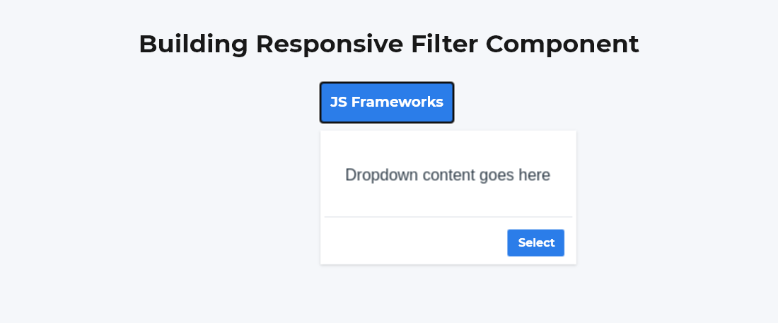
Now further, we need to implement this for mobile devices.
Implementing the Modal for Mobile Devices using Reach UI
The concept of modal might simple- to cover the entire screen with the title at the top. But, when it comes to implement and start coding, believe me, it can be challenging. We would be using Reach UI for managing focus states, semantics, and other difficulties related to the modal components. You can prefer any library which has a Modal component; it’s totally up to your choice. Since I’m familiar with Reach UI, I would go with that.
I’ll create a component – FilterModalComponent, that would contain my Modal. And later, I’ll import this into my FilterComponent.
// FilterModalComponent.js
import React from "react";
import { DialogOverlay } from "@reach/dialog";
import "./FilterModalComponent.css";
const FilterModalComponent = React.forwardRef(
({ children, onSelect, onCancel }, ref) => {
return (
< div className="modal_wrapper" >
< DialogOverlay
ref={ref}
className="modal_container"
aria-label="modal window"
>
< div className="modal_header" >
< button onClick={() => onCancel()} >x< /button >
< /div >
< div className="modal_content" >{children}< /div >
< div className="modal_actions" >
< button onClick={() => onSelect()} >Select< /button >
< /div >
< /DialogOverlay >
< /div >
);
});
export default FilterModal;
And the CSS file of FilterModal is here –
// FilterModalComponent.css
.modal_wrapper {
 display: block;
 background-color: transparent;
}


@media (min-width: 768px) {
 .modal_wrapper {
   display: none;
 }
}

.modal_container {
 z-index: 60;
 display: flex;
 background-color: white;
 right: 0;
 flex-direction: column;
 position: fixed;
 top: 5px;
}

.modal_header {
 padding: 20px 12px;
 border-bottom-color: #e4e6eb;
 display: flex;
 border-bottom-width: 10px;
}

.modal_content {
 display: flex;
}

.modal_actions {
 display: flex;
 align-items: center;
 border-top-width: 3px;
 justify-content: flex-end;
 margin-top: 5px;
 border-top-color: #e4e7eb;
 padding: 8px;
}

.modal_actions button {
 font-weight: 500;
 border-radius: 2px;
 padding: 5px 8px;
 cursor: pointer;
 background-color: #2b7de9;
 width: auto;
 color: white;
}
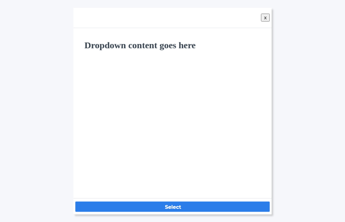
Our Filter Modal component is ready, which will only appear for small screens because of this –
@media (min-width: 768px) {
 .modal_wrapper {
   display: none;
 }
}
This is how our component will look like.
Now, it’s time to import this FilterModalComponent into the FilterComponent. Keep in mind that modal expects Ref to prevent it from closing unexpectedly, and other props like – onSelect and onCancel, for controlling the user’s actions.
import React, { useState, useRef, useEffect } from "react";
import "./FilterComponent.css";
import FilterModalComponent from "./FilterModalComponent";
export default function FilterComponent() {
const [isOpen, setIsOpen] = useState(false);
const dropdownRef = useRef(undefined);
const buttonRef = useRef(undefined);
const modalRef = useRef(undefined);
useEffect(() => {
const handleClick = event => {
const isDropdownClicked = dropdownRef.current && dropdownRef.current.contains(event.target);
const isButtonClicked = buttonRef.current && buttonRef.current.contains(event.target);
const isModalClicked = modalRef.current && modalRef.current.contains(event.target);
if (isDropdownClicked || isButtonClicked || isModalClicked) {
// We would do nothing if the ref is undefined or user clicks on menu.
return;
}
// Or else close the menu.
setIsOpen(false);
};
document.addEventListener("mousedown", handleClick);
document.addEventListener("touchstart", handleClick);
// cleanup
return () => {
document.removeEventListener("mousedown", handleClick);
document.removeEventListener("touchstart", handleClick);
};
}, [dropdownRef, buttonRef, modalRef]);
const handleSelect = () => {
alert("Yay! Filters applied!");
setIsOpen(false);
};
return (
< div className="filter_wrapper" >
< button
ref={buttonRef}
onClick={() => setIsOpen(!isOpen)}
className="filter_button"
>
JS Frameworks
< /button >
{isOpen && (
< div ref={dropdownRef} className="filter_dropdown" >
< div >
Dropdown content goes here
< div className="filter_dropdown_actions" >
< button onClick={() => handleSelect()} className="filter_dropdown_button" >
Select
< /button >
< /div >
< /div >
< /div >
)}
{isOpen && (
< FilterModalComponent
ref={modalRef}
onSelect={() => handleSelect()}
onCancel={() => setIsOpen(false)}
>
Modal content goes here.
< /FilterModalComponent >
)}
< /div >
);
}
Putting all the pieces together
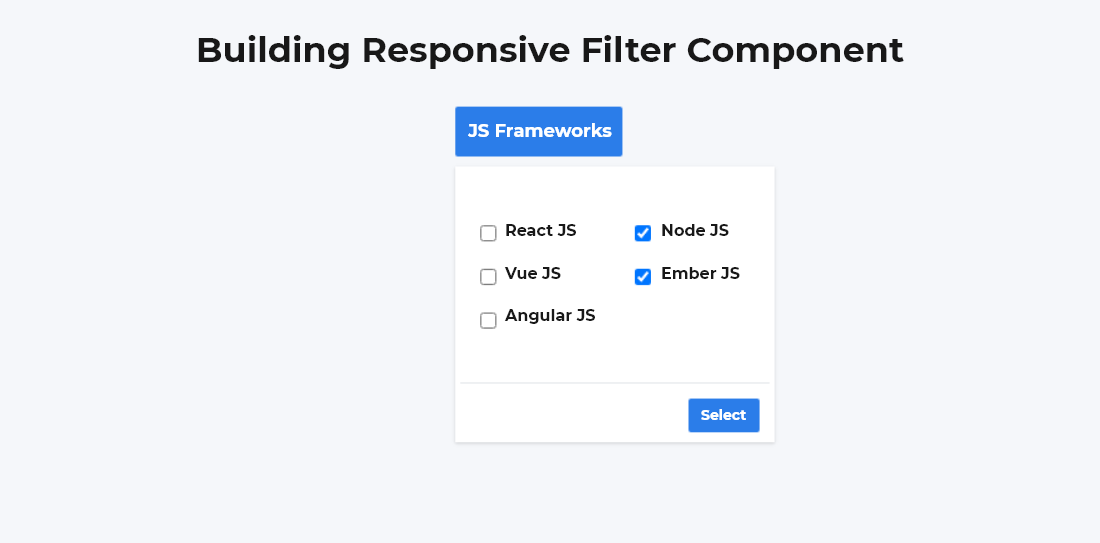
Now, it’s time to give actual user inputs and see how it works. We are going to implement multiple select filters from which users can choose the JS framework.
import React, { useState } from "react";
import "./main.css";
import FilterComponent from "./FilterComponent";
const frameworks = ["ReactJS", "AngularJS", "VueJS", "NodeJS", "EmberJS"];
export default function DemoApp() {
const [selectedFrameworks, setSelectedFrameworks] = useState([]);
const handleSelect = framework => {
const isSelected = selectedFrameworks.includes(framework);
const newSelection = isSelected
? selectedFrameworks.filter(currentTech => currentTech !== framework)
: [...selectedFrameworks, framework];
setSelectedFrameworks(newSelection);};
return (
< div className="app_container" >
< h2 >Building responsive filter component< /h2 >
< FilterComponent
label="JS Frameworks"
onSelect={() => alert(selectedFrameworks)}
>
< div className="frameworks-list" >
{frameworks.map((framework, index) => {
const isSelected = selectedFrameworks.includes(framework);
return (
< label key={index} >
< input
type="checkbox"
checked={isSelected}
onChange={() => handleSelect(framework)}
/ >
< span className="ml-2 text-base text-gray-500 font-heading" >
{framework}
< /span >
< /label >
);
})}
< /div >
< /FilterComponent >
< /div >
);
}
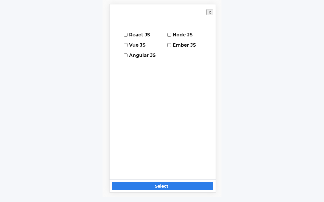
This is how our Filter component with checkboxes of JS frameworks looks like –
And on mobile screens –
Conclusion
So, this was about how to build a responsive filter component. I hope you are pretty clear about its implementation. If you are looking for any development support regarding ReactJS development, then Bacancy Technology is a one-stop solution to hire ReactJS developer to build an optimal product.


